Choosing the Right Report Widgets for a Dashboard: A Comprehensive Guide

When creating an effective dashboard, choosing the right report widgets is paramount. Selecting visualizations that align with your audience’s needs can make all the difference in providing valuable insights and driving data-driven decisions. This comprehensive guide will explore the best practices for choosing the right report widgets for a dashboard to ensure your dashboard delivers maximum impact.

Consider Your Audience
The first step in choosing the right report widgets for a dashboard is understanding your audience. Tailor your visualizations to cater to the preferences and requirements of the intended users. By doing so, you’ll ensure that the dashboard is easily understandable and relevant to the individuals who rely on it for critical information.
Utilize Line Charts for Trends
Line charts for trends are indispensable for visualizing time-series data on your dashboard. Whether you’re tracking monthly sales figures or quarterly growth rates, line charts enable quick identification of patterns and trends. Their simplicity and effectiveness make them the go-to choice for presenting historical data and forecasting future insights.
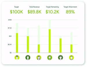
Opt for Bar Graphs for Comparisons
When comparing performance between different categories, such as sales across products, regions, or sales representatives, bar graphs for comparisons are a powerful option. These visualizations make it effortless for users to compare data points and identify top performers, helping them easily make informed decisions.
Use Pie Charts Sparingly
While pie charts can be visually appealing, use them sparingly and judiciously. They work best when representing the proportions of a whole, such as market share. However, in cases with multiple categories or subtle differences between them, consider alternatives like bar graphs for more straightforward and more insightful comparisons.
Leverage Tables for Detailed Data
Incorporating tables for detailed data in your dashboard can give users precise information in a well-organized format. Ensure that you strike the right balance between data comprehensiveness and readability. Additionally, consider adding interactive features like sorting and filtering options to enhance the user experience.
Utilize Gauge or Dial Charts for KPIs

Key Performance Indicators (KPIs) are critical metrics for monitoring progress toward specific targets. For effectively presenting KPIs, consider employing gauge or dial charts. These visualizations provide a clear and intuitive representation of progress, allowing stakeholders to grasp the current status and take appropriate actions.
In conclusion, the success of your dashboard hinges on choosing the right report widgets for a dashboard. By understanding your audience and leveraging the strengths of each visualization type, you can craft a compelling dashboard that empowers data-driven decision-making. Embrace line charts for trends, bar graphs for comparisons, and tables for detailed data while using pie charts judiciously. Additionally, gauge or dial charts will enhance your dashboard’s ability to track KPIs effectively. Armed with this knowledge, you can create a powerful and impactful dashboard that confidently drives your organization forward.
See Maximizer’s latest report widgets in our self guided product tour.
Looking for a CRM that balances power and simplicity?
Discover how Maximizer outperforms legacy CRMs with the tools your team actually needs.
Subscribe to our Newsletter
Related Articles

